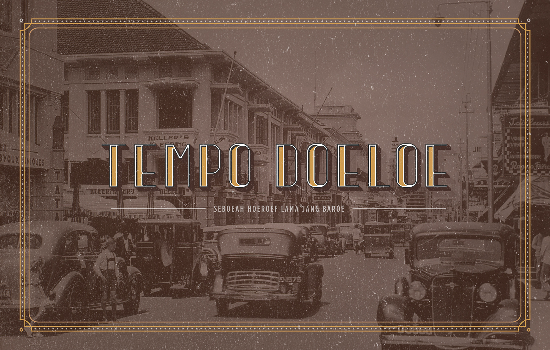
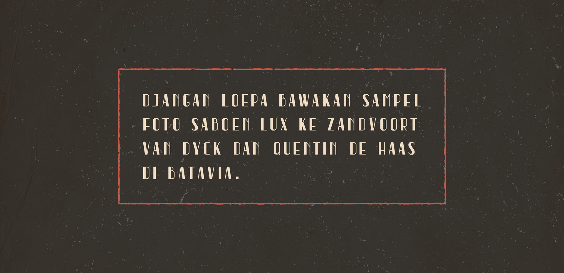
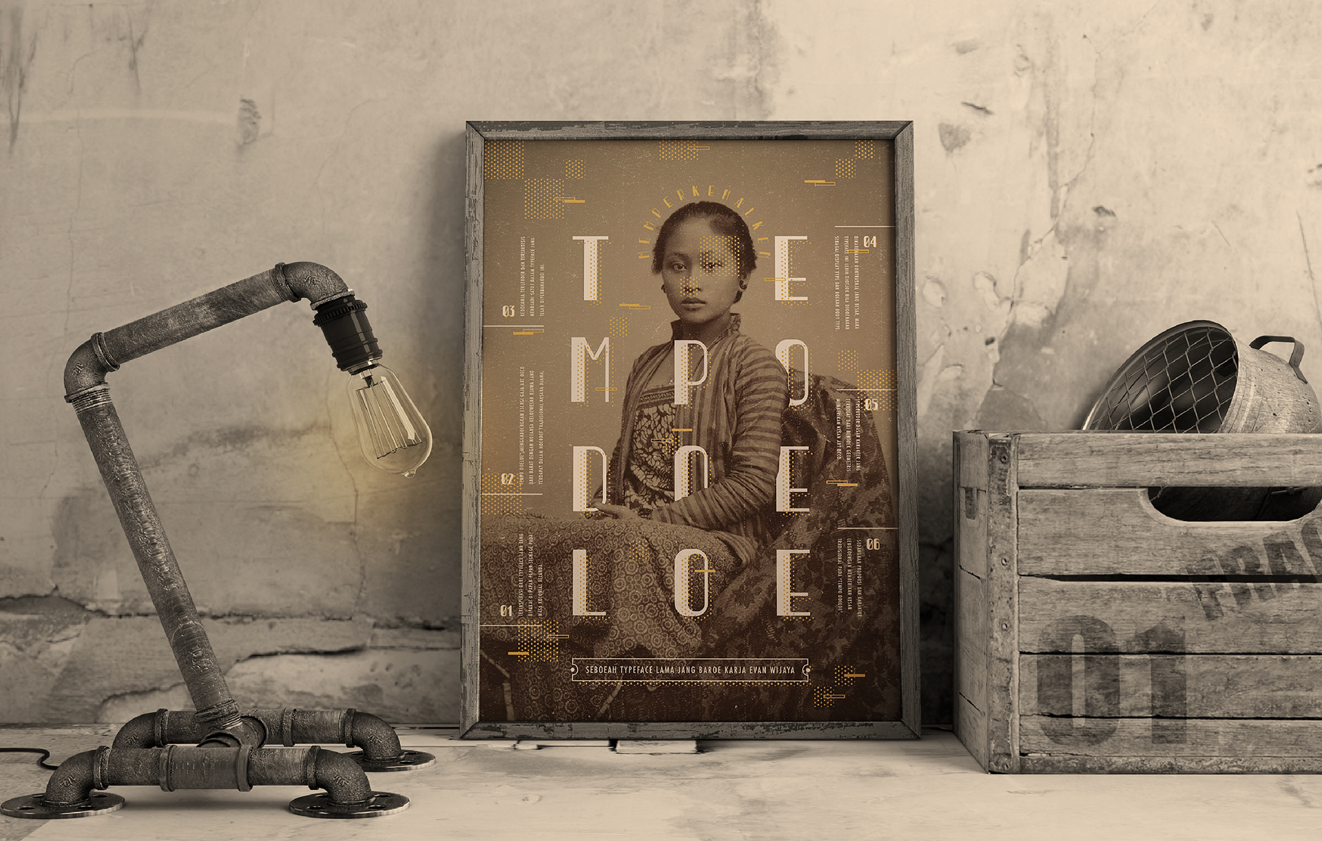
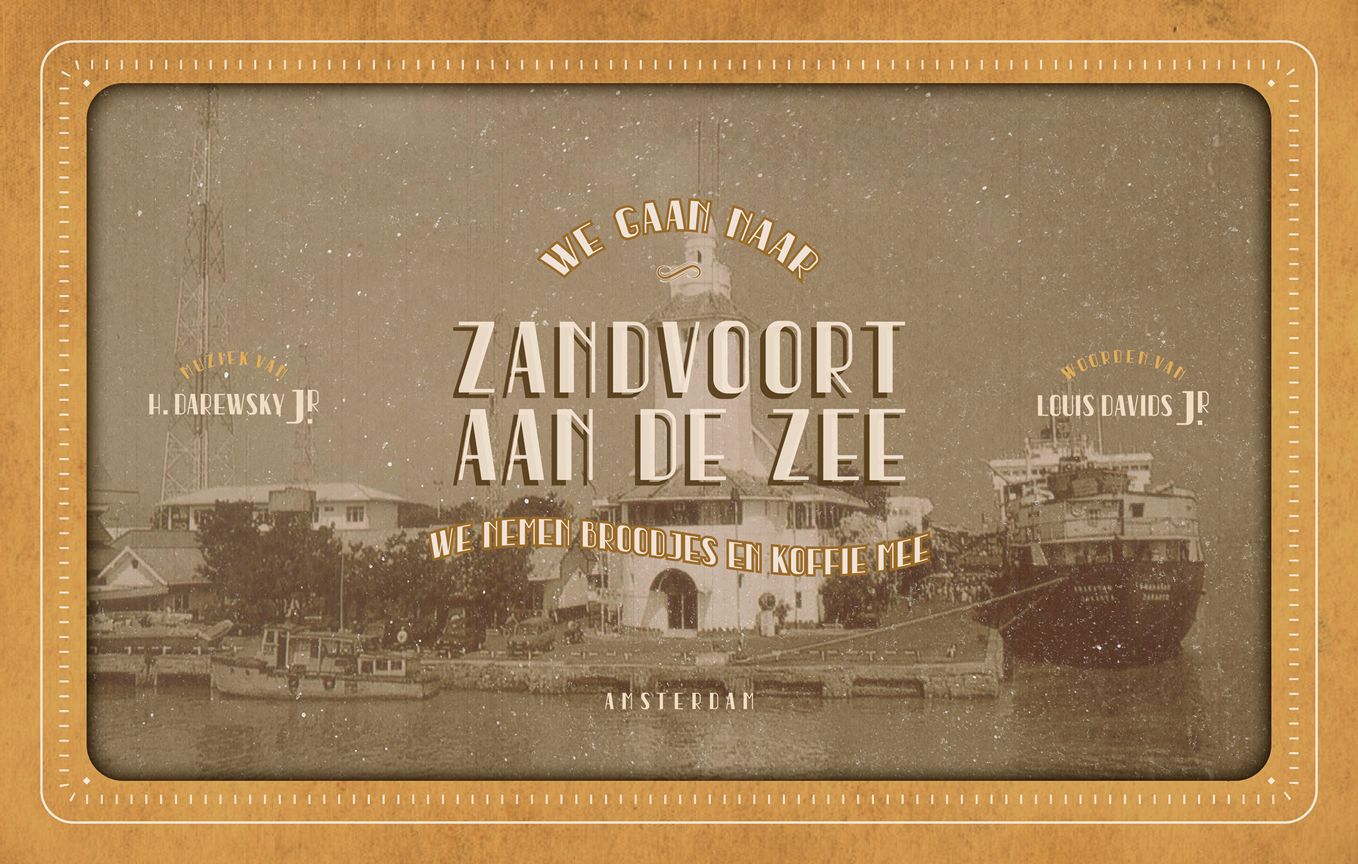
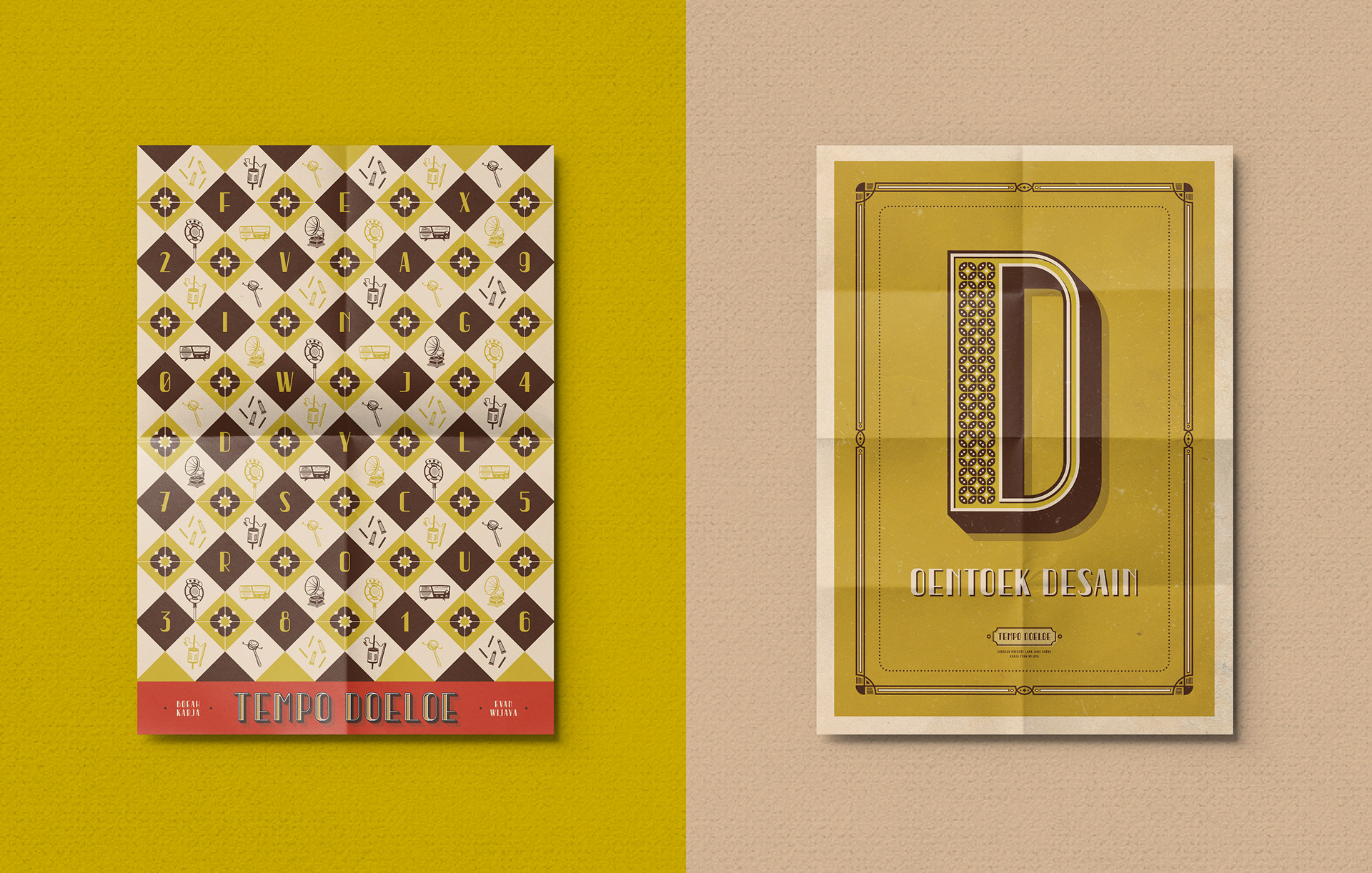
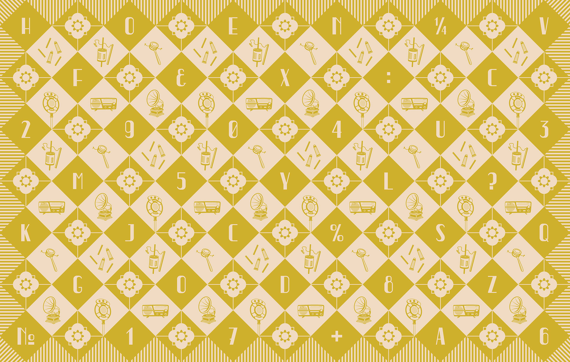
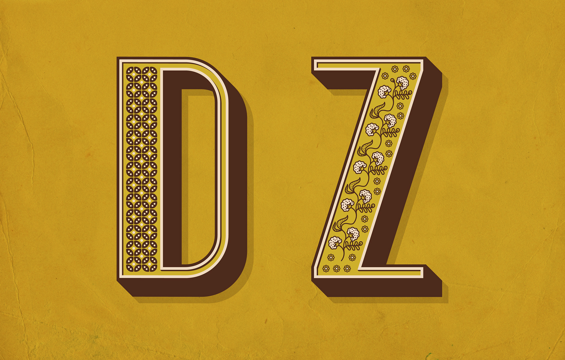
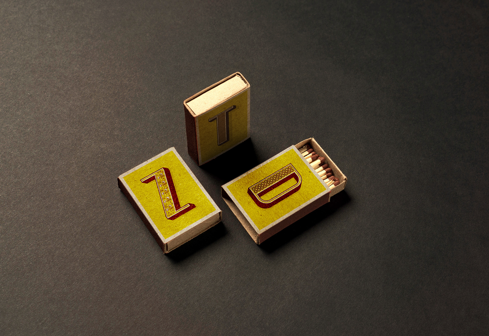
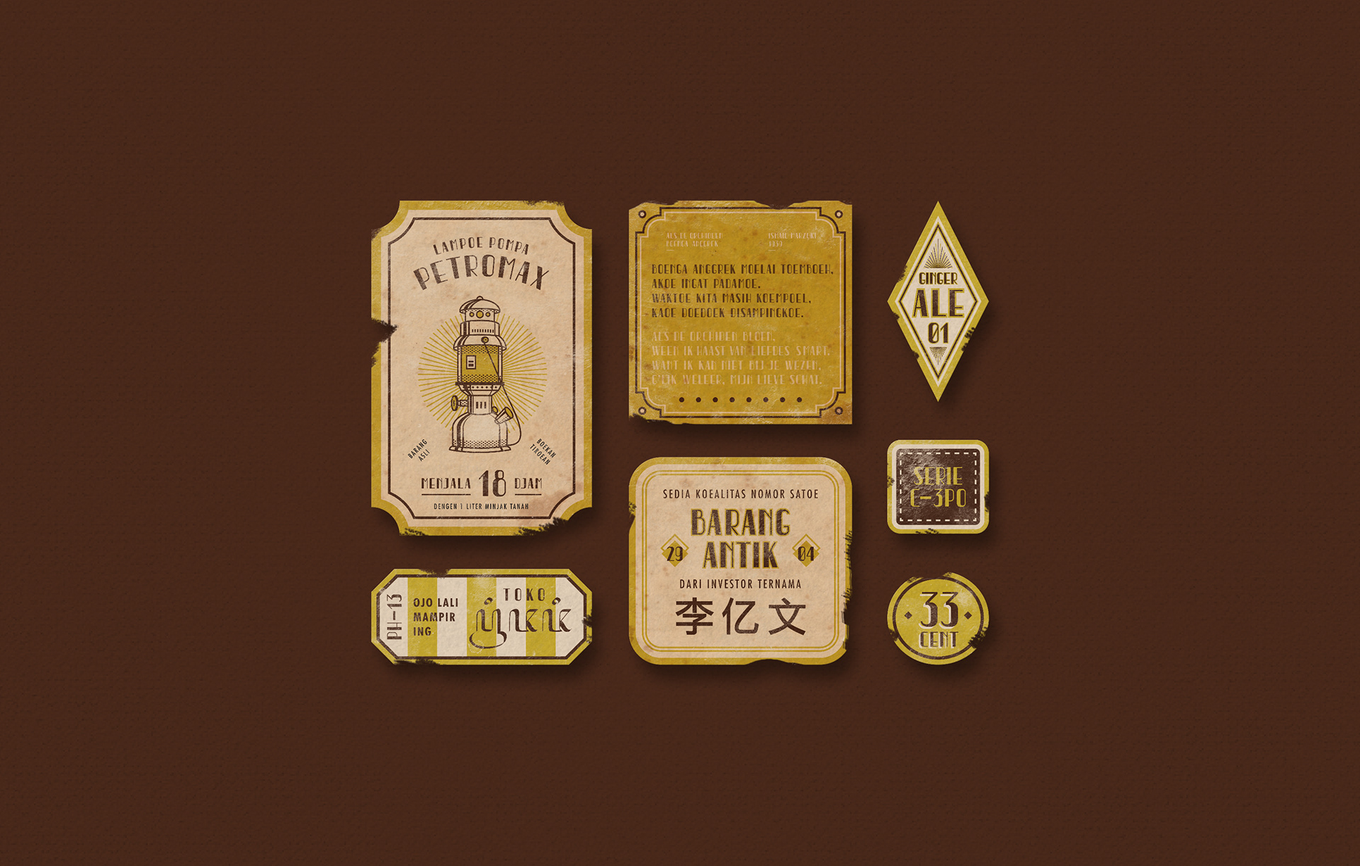
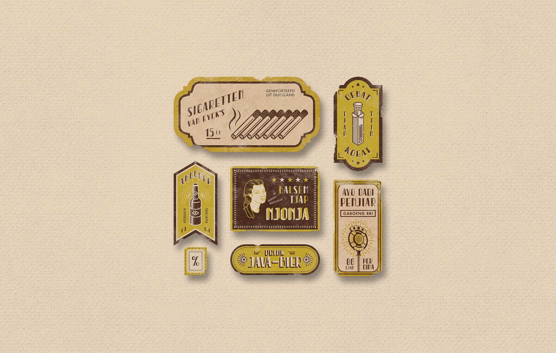
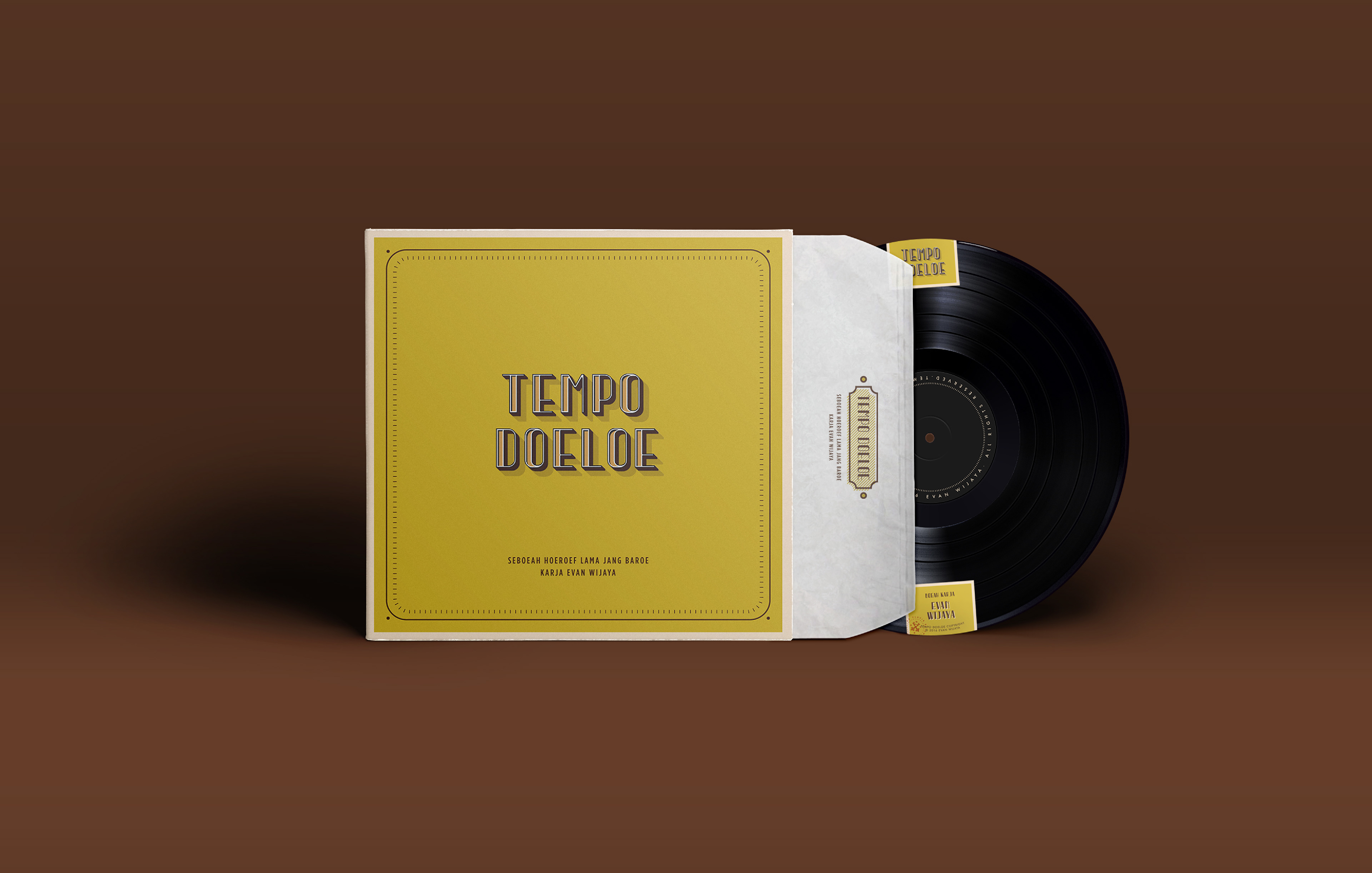
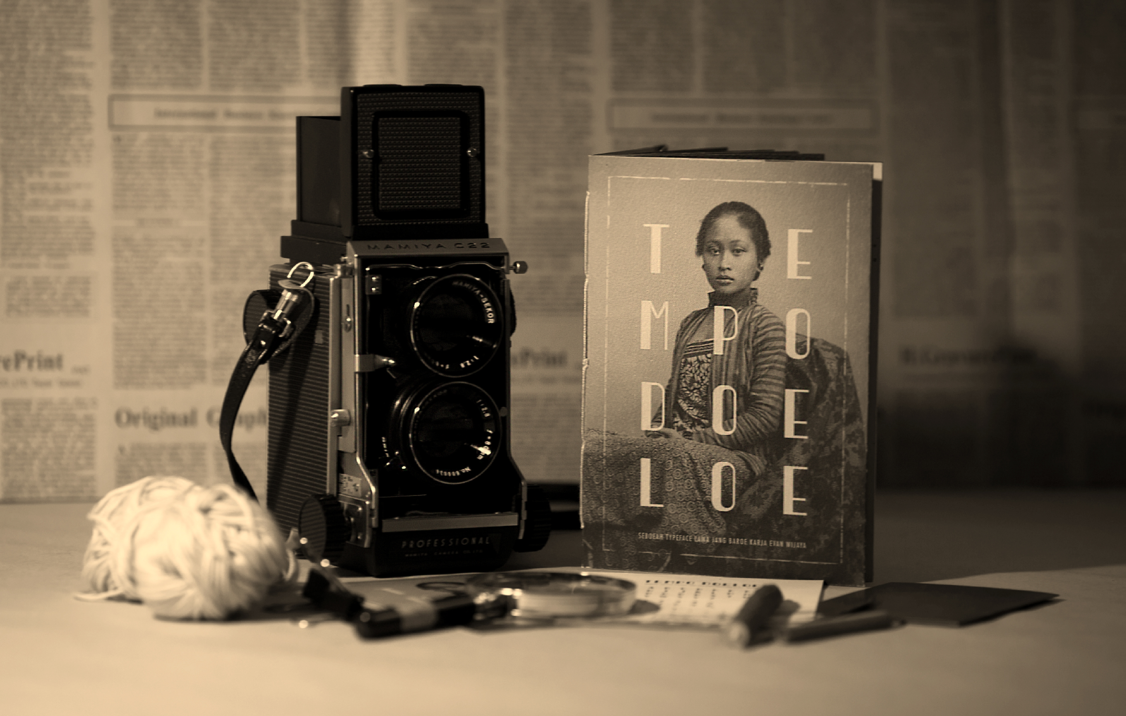
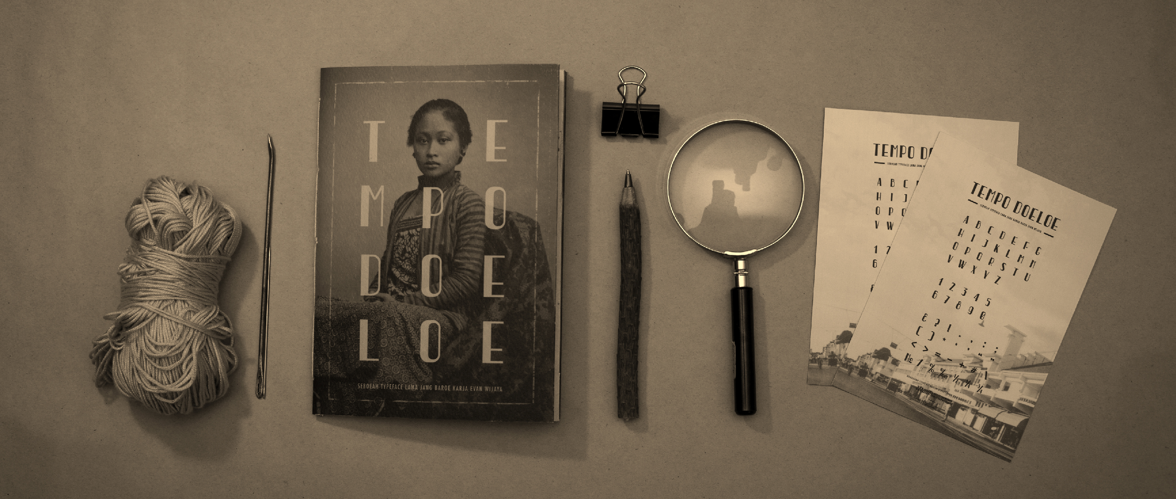
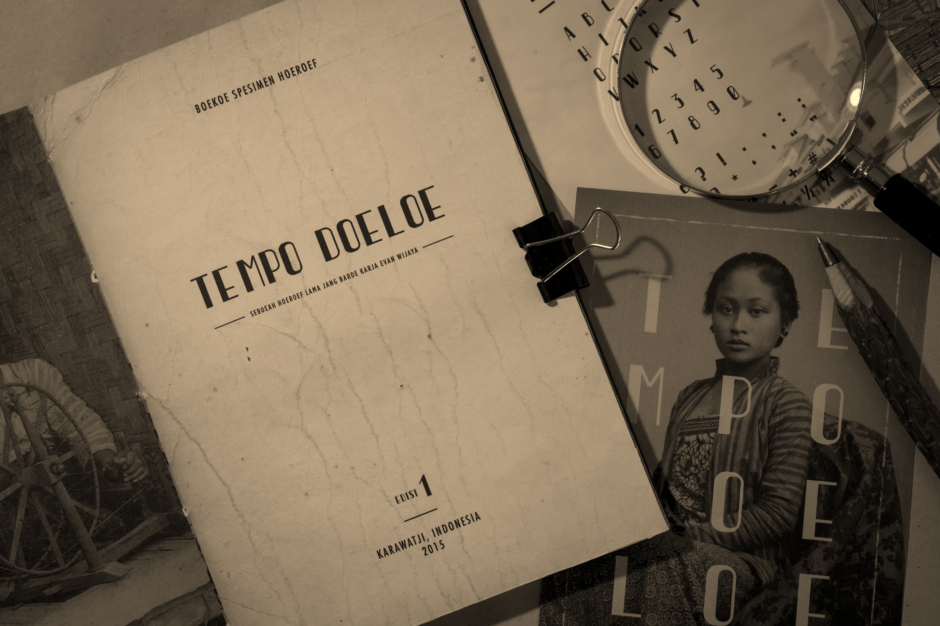
The typeface is called "Tempo Doeloe", meaning "Old Times" in English. The inspiration of the typeface came from letters that were used on old signages on buildings and public places in Indonesia at past times, especially during the Dutch colonialism era.
Indonesia was colonized by the Dutch for almost 350 years, from 1602 until 1949. Between those years, the Indonesian people greatly suffered under the notorious imperialism of the Dutch government. People were forced to do whatever the Dutch wanted. Though other than suffering, they also brought some great influences from the West to the East, such as science in biology, chemistry and physics, mathematics, engineering, politics, and most importantly: culture. Through the Dutch, Indonesia has gotten lots of influences up until today, especially in the fields of art and design.
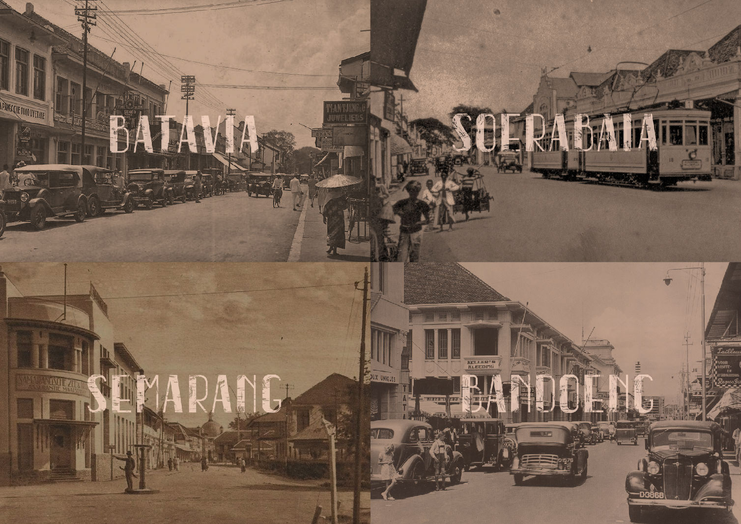
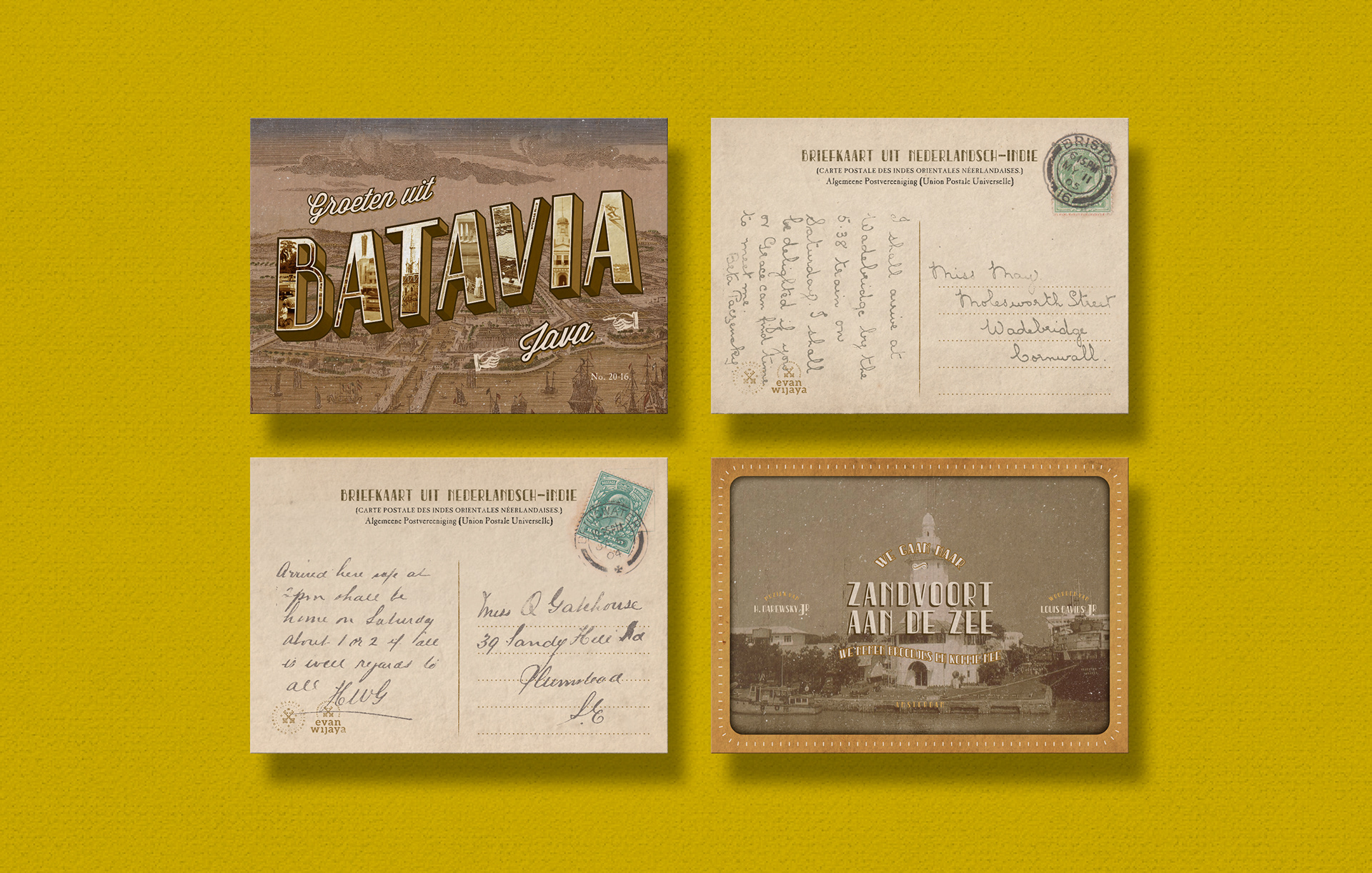
One of the most visible influences can be seen through the paintings, drawings, architectures, and last but not least, typography as part of graphic design. Around 1920-1930s, the West was on the zeitgeist of the Art Deco era. It was so popular at that time that the Dutch also brought the Art Deco culture to Indonesia. This can be seen through the vintage Indonesian postcards, advertisements, and signages. They mixed the traditional culture of Indonesia with the Art Deco style and the results were amazing; they were incredibly beautiful. You can probably see how wonderful the traditional feel of the Indonesian culture was mixed with Western influences back then.
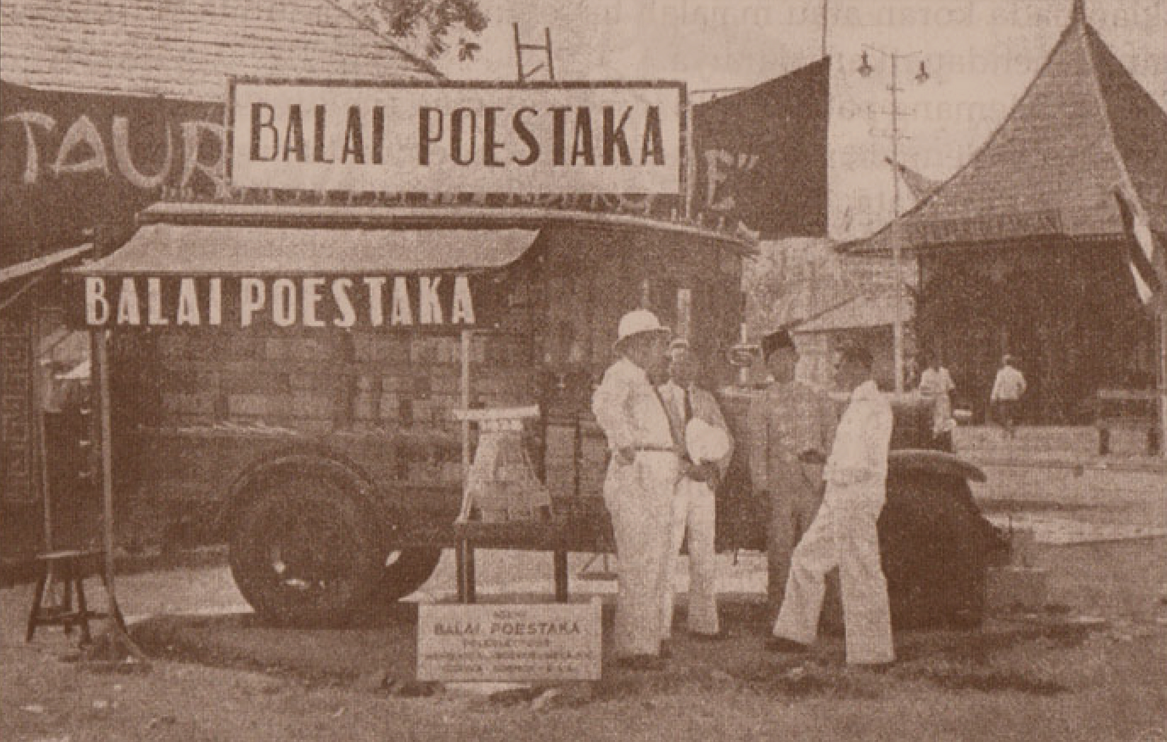
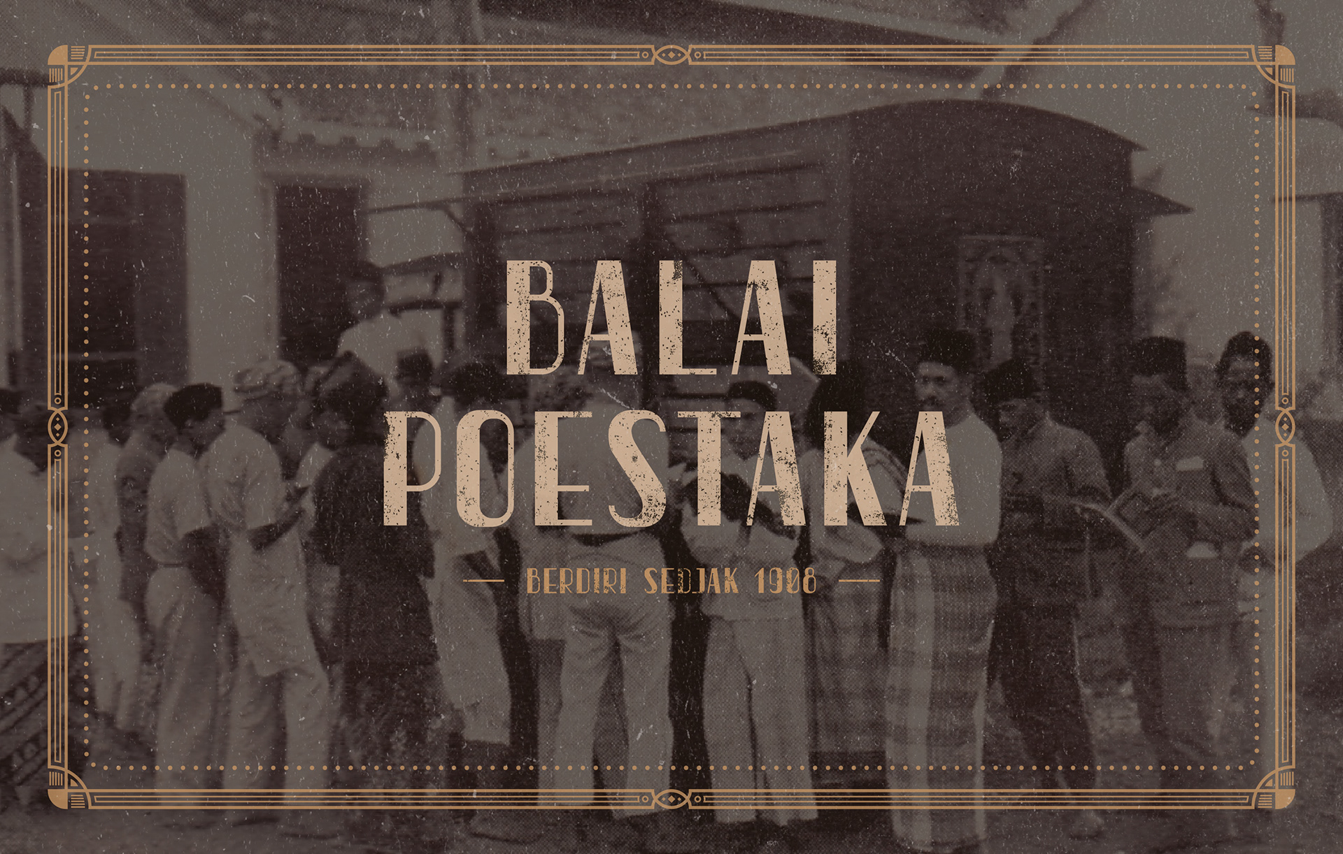
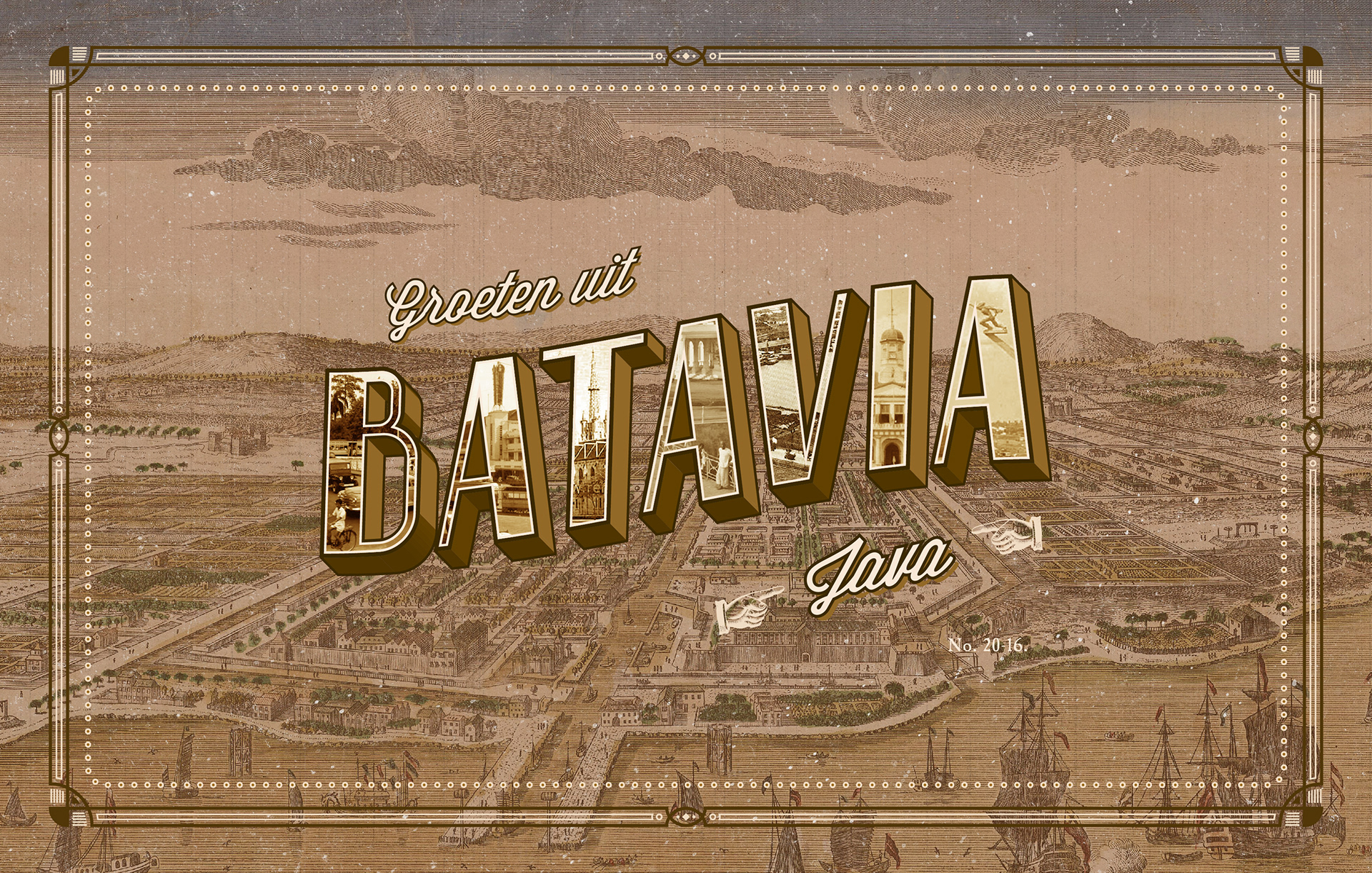
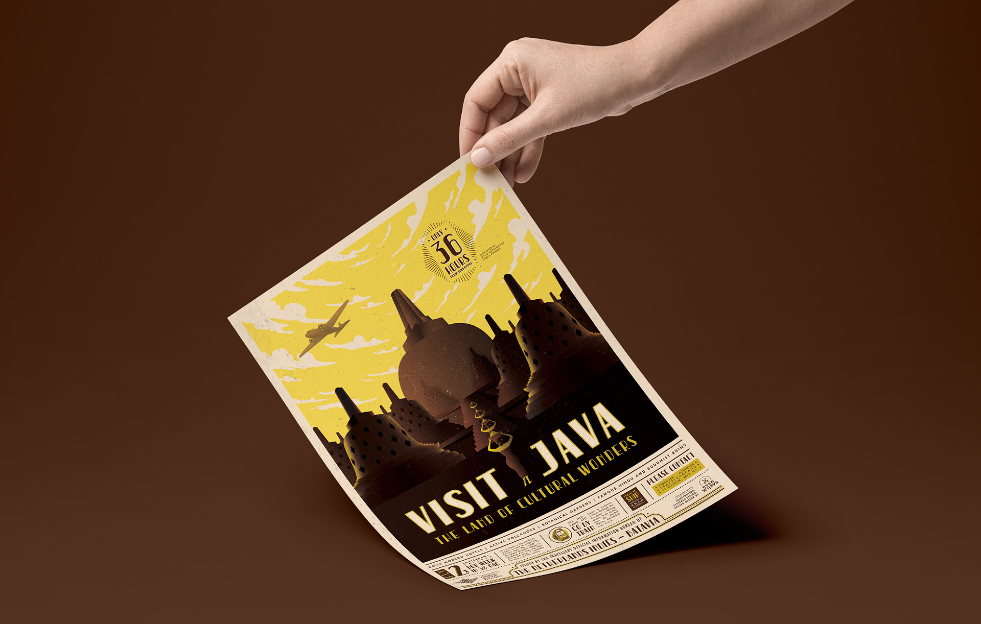
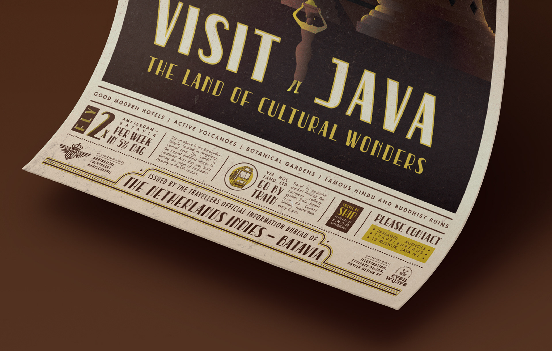
One of the signage whose typography was influenced by the Art Deco style was the "Balai Poestaka" signage. Balai Poestaka, meaning "Bureau of Literature", is the state-owned publisher of Indonesia and publisher of major pieces of Indonesian literature such as Salah Asuhan, Siti Nurbaya, and Layar Terkembang. Its head office was in Batavia, currently named Jakarta, the capital city of Indonesia.
On September 14, 1908 the Dutch colonial government established the Commission for People's Education and Reading (Dutch: Commissie voor de Inlandsche School en Volkslectuur). It served to bring formal education to native Indonesians. Then in 1917, changed into Kantoor voor de Volklectuur, Balai Poestaka was used by the Dutch colonial government as a means to control native Indonesians' access to information.
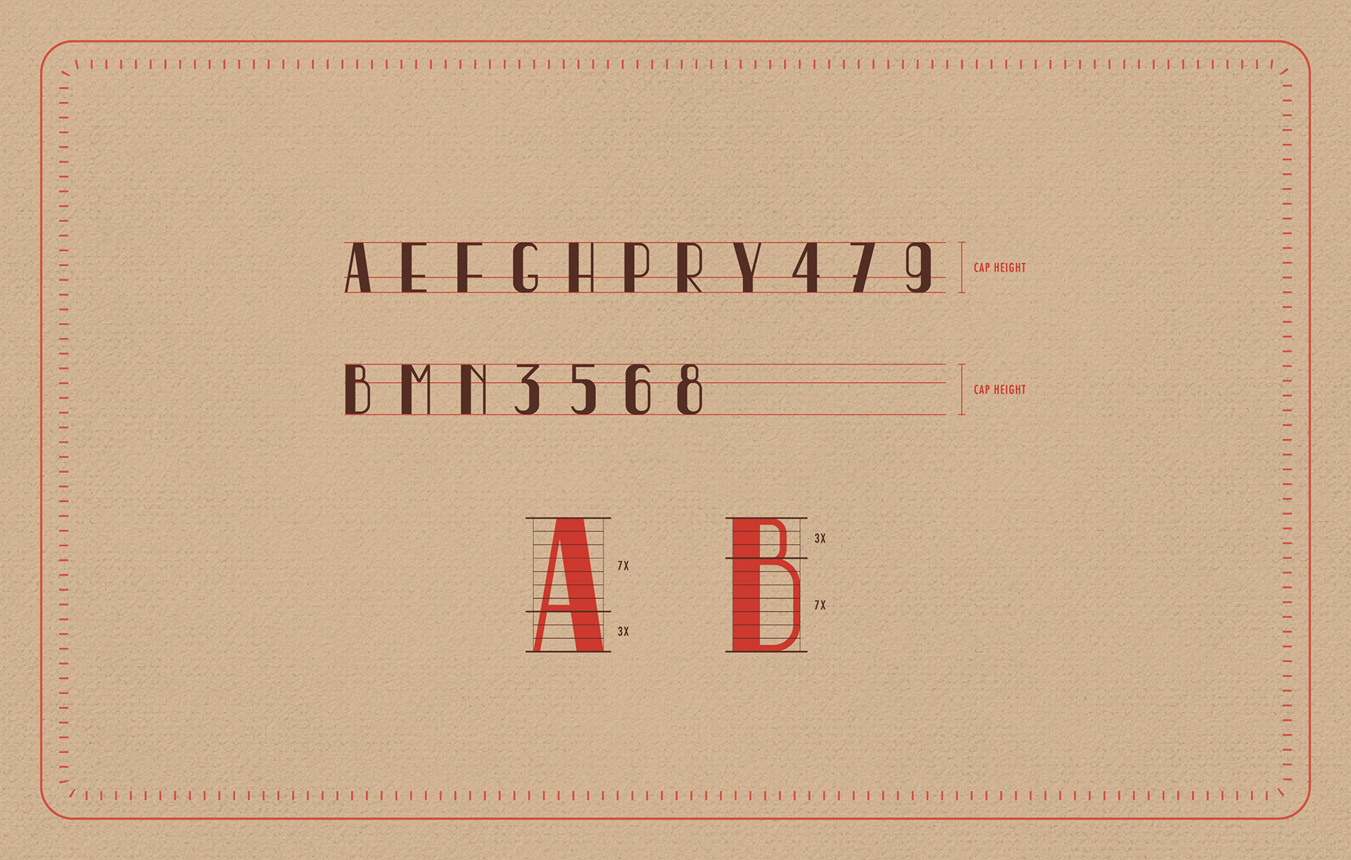
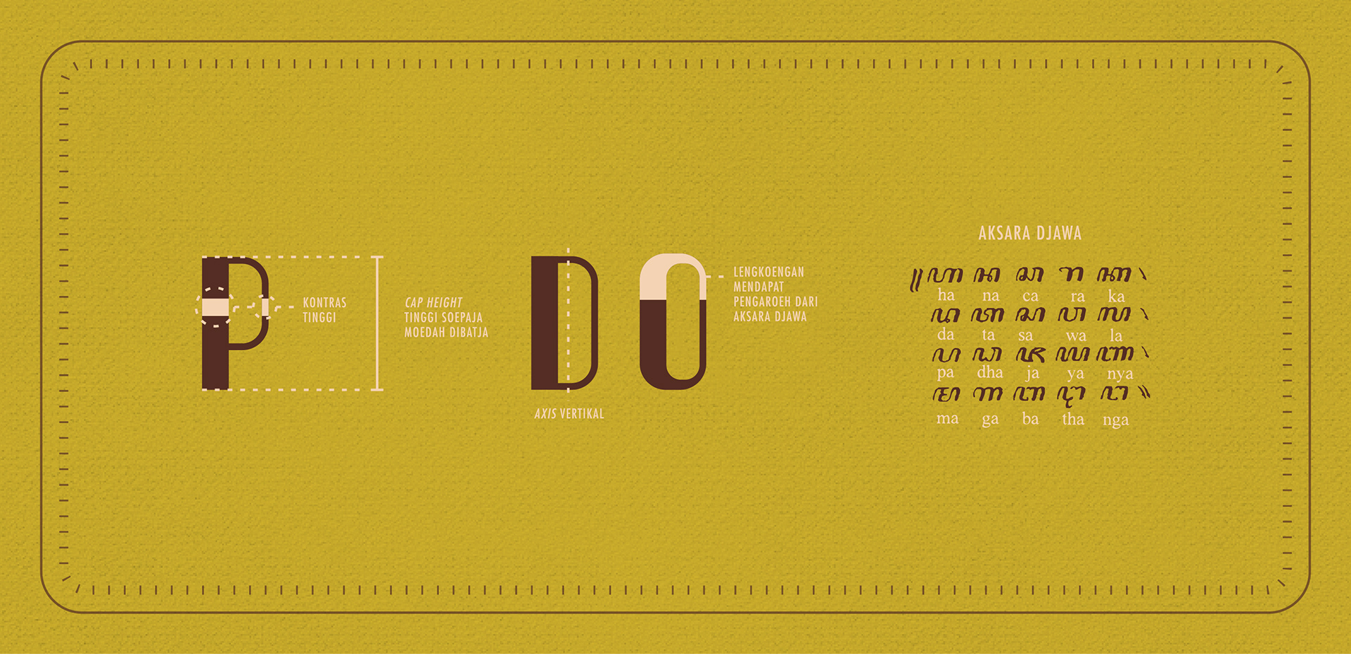
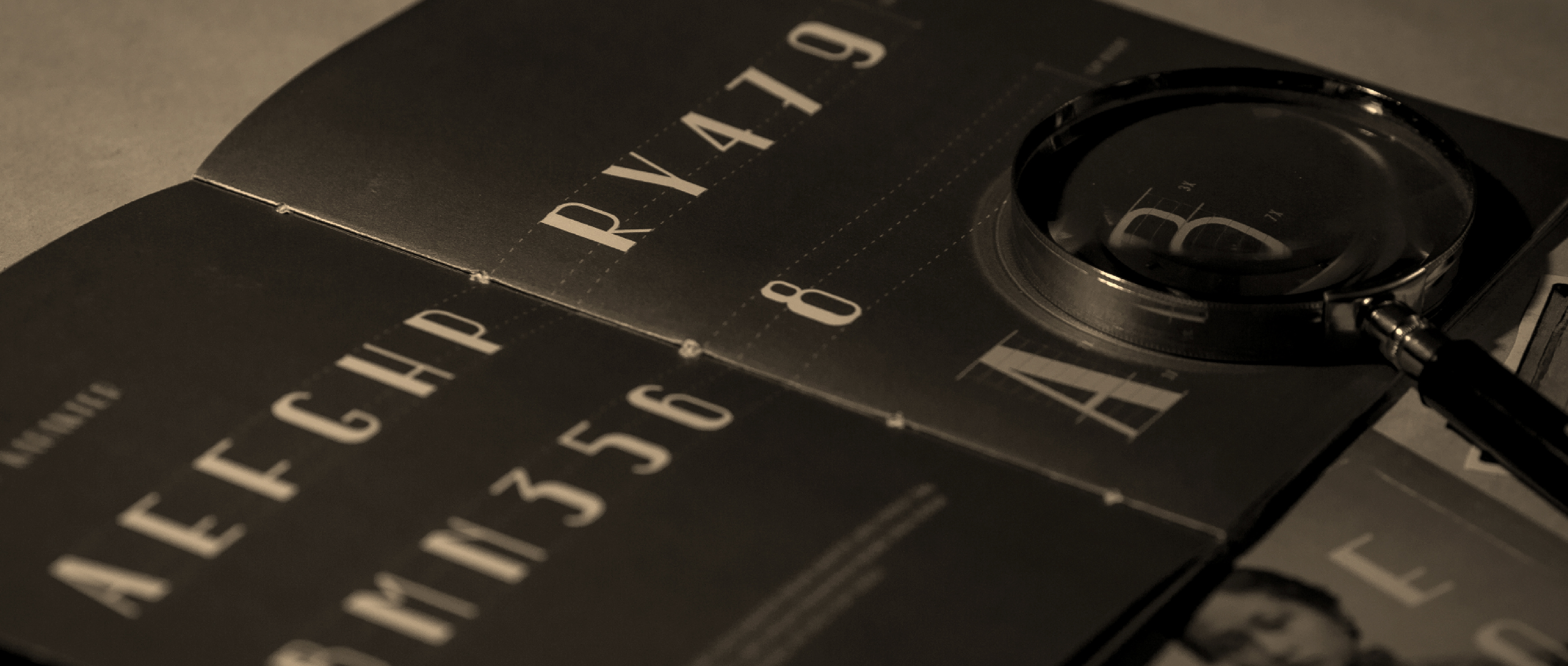
The typography of the signage shown above reflects how influenced Indonesia was by the Western culture. The letters were so influenced by the Art Deco style; notice the contrast and the basic form used. Though influenced by the West, somehow the type was, intentionally or not, slightly altered and adjusted to match the Indonesian culture well.
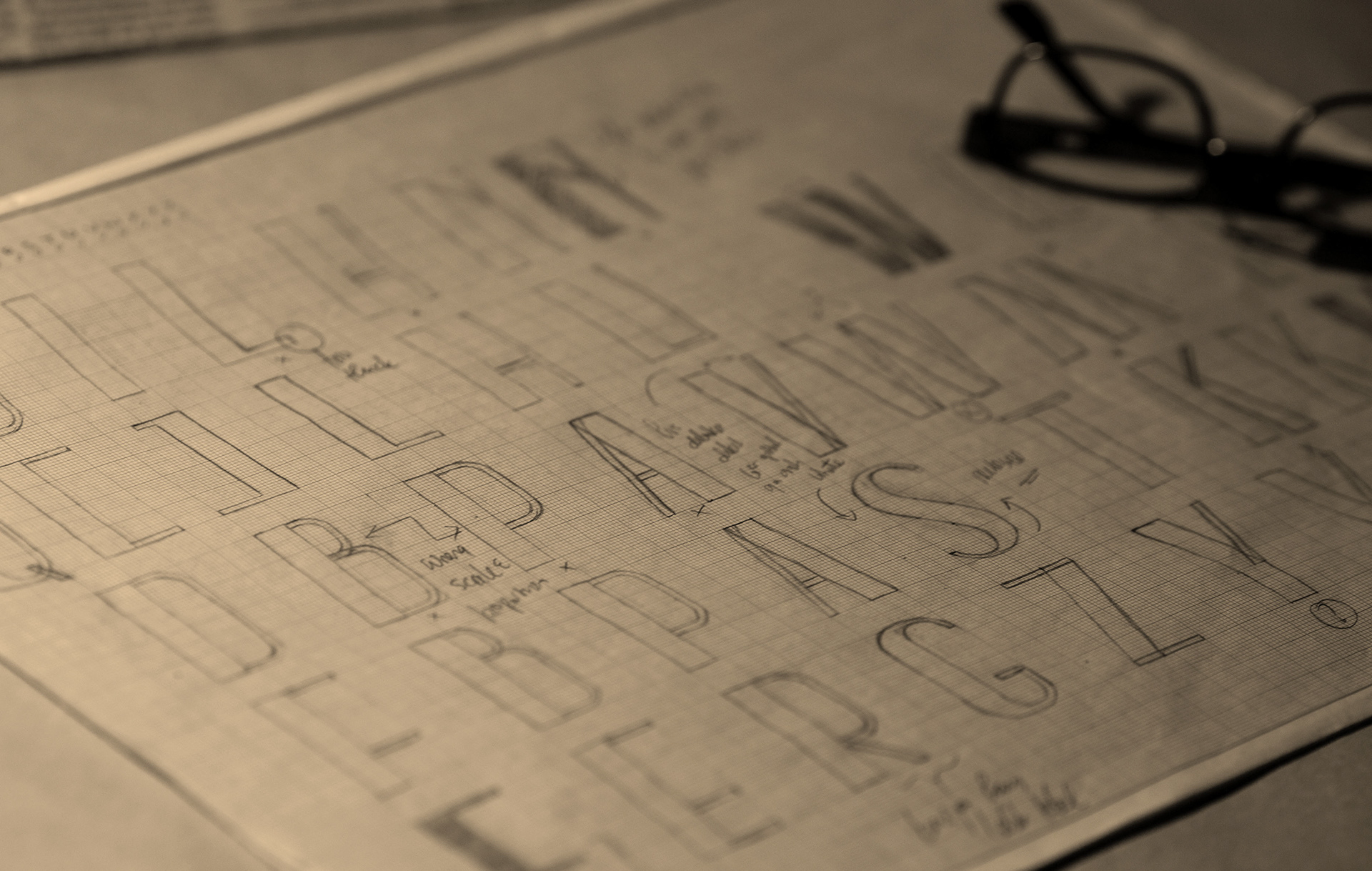
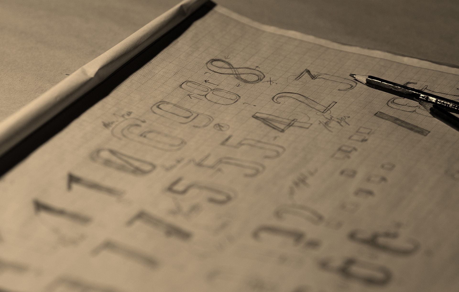
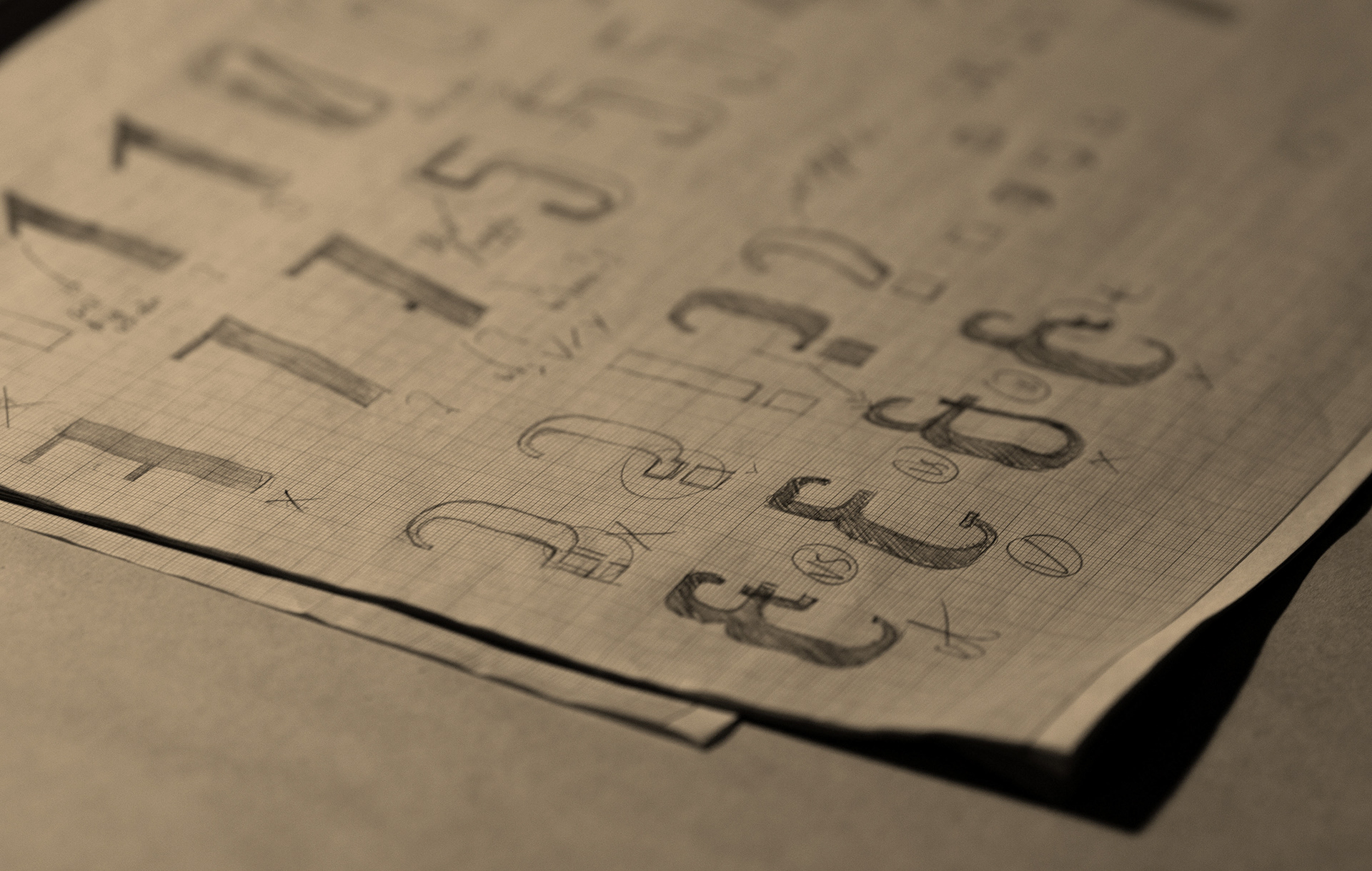
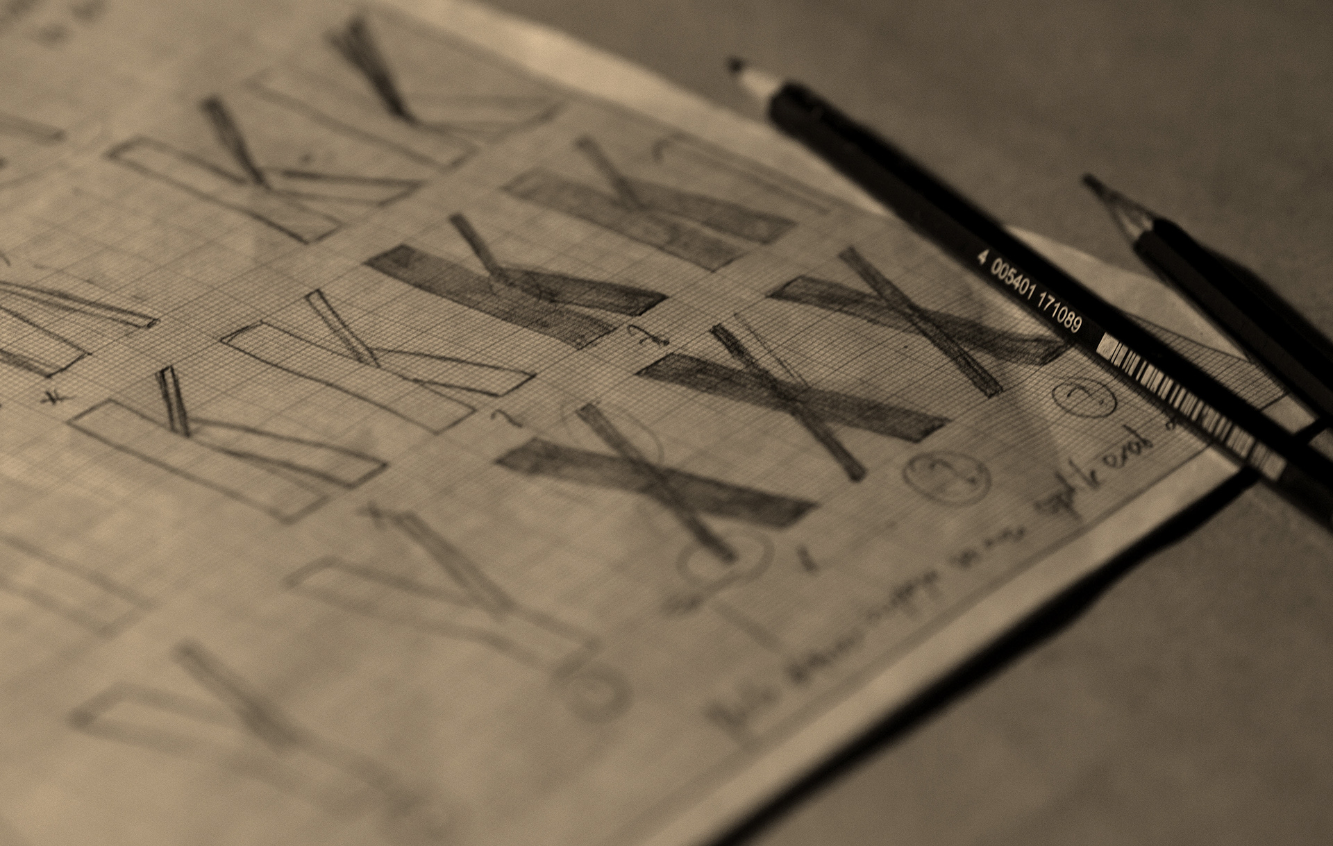
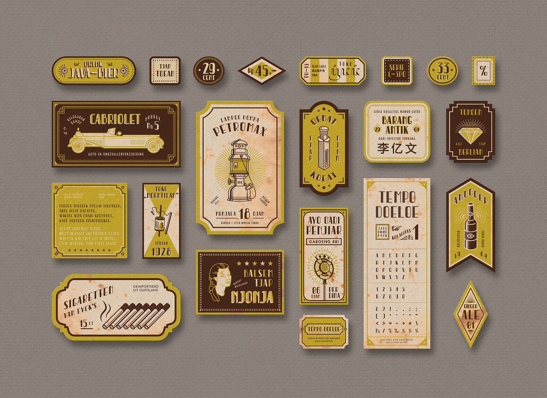
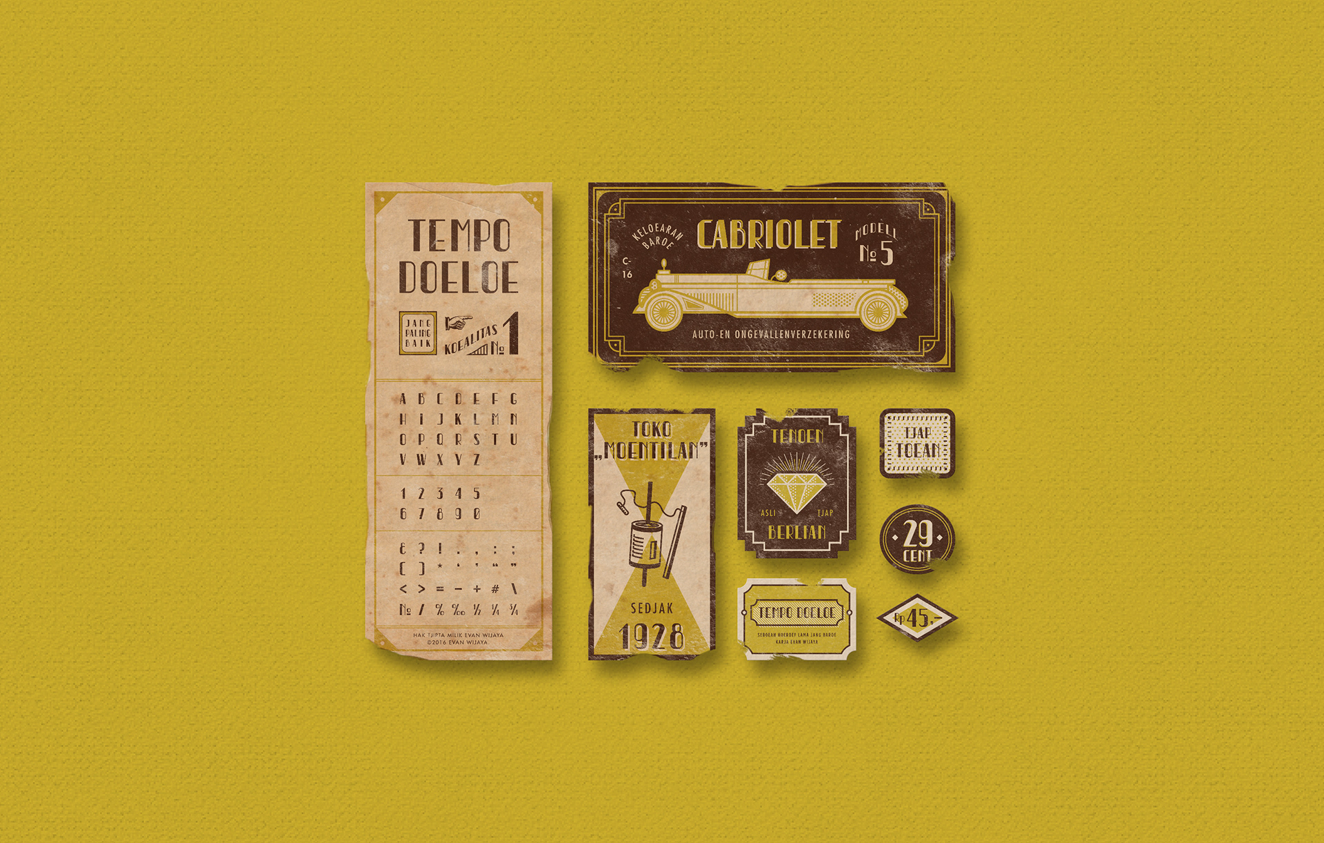
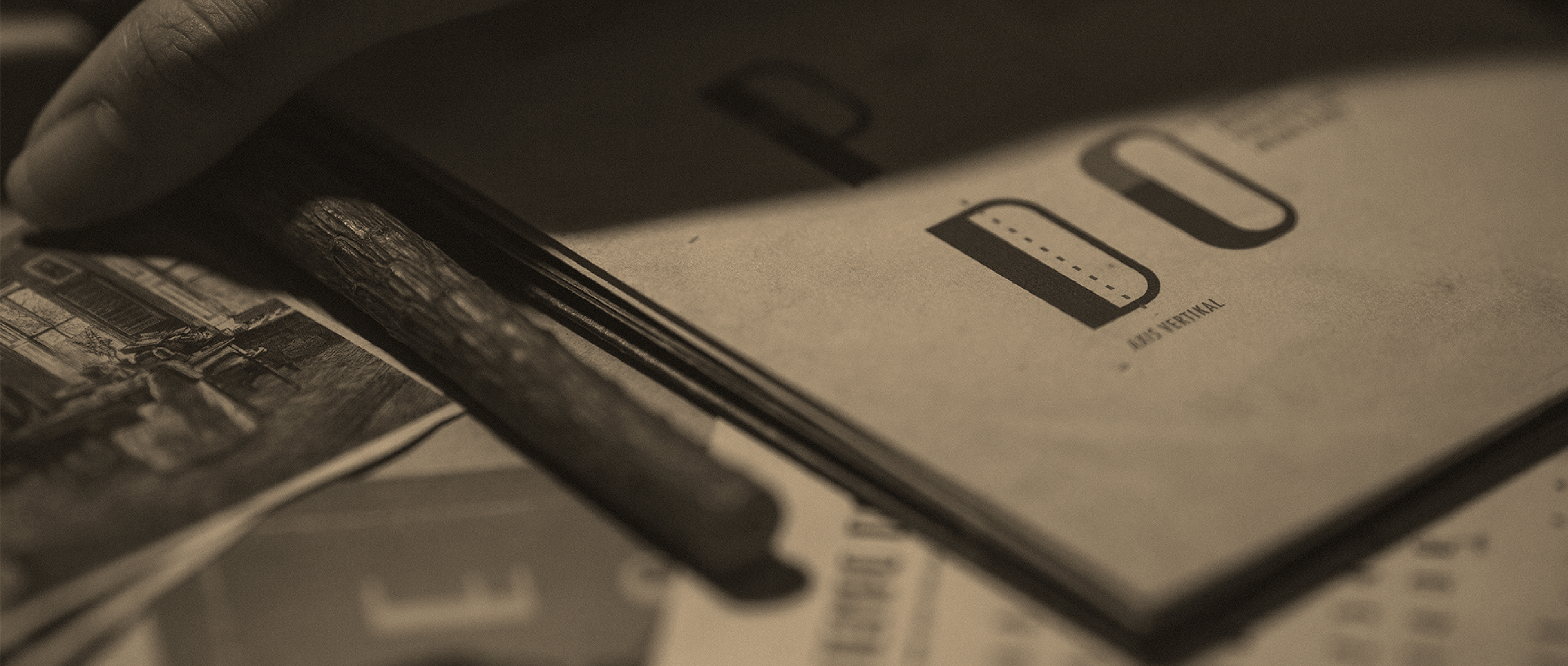
The challenge was to design a typeface based on the Balai Poestaka signage with a modern touch. The typeface should have the "old times" characteristics of Indonesia. In order to make it more traditional, I decided to give the typeface one more influence from the birth place of Balai Poestaka: Java Island. I combined the essence of the Javanese Script, or natively known as Aksara Jawa. The script was developed by the Javanese people. It is a descendant of the Brahmi script from India and has many similarities with the modern scripts of South and Southeast Asia.
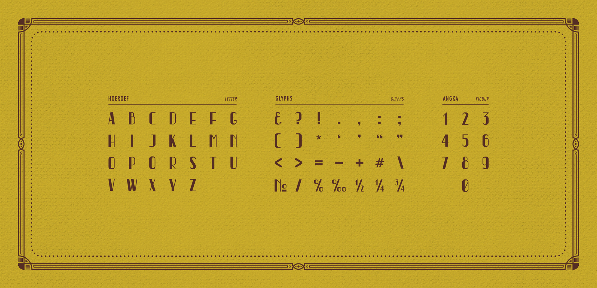
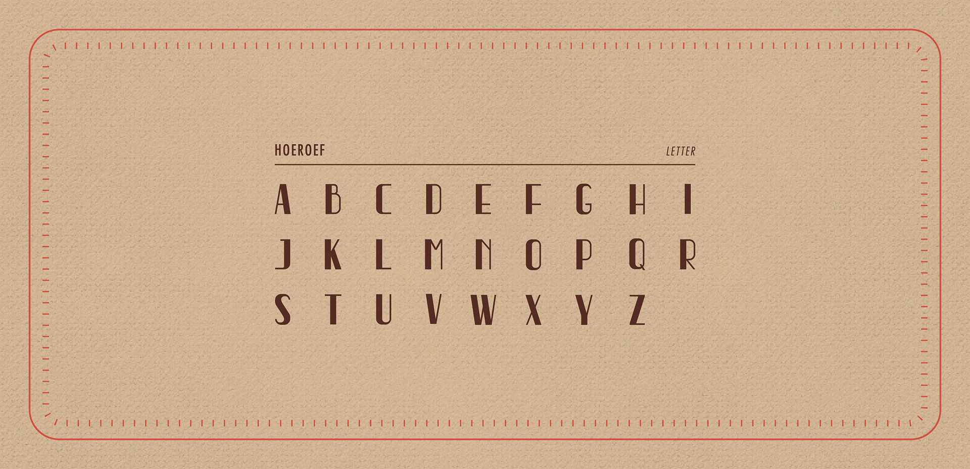
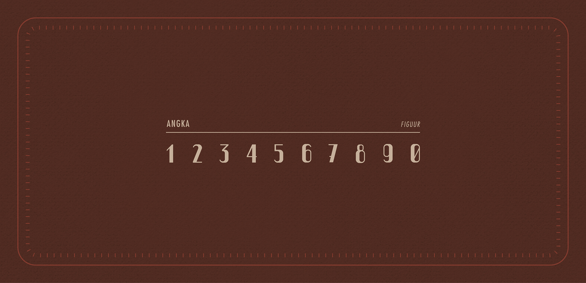
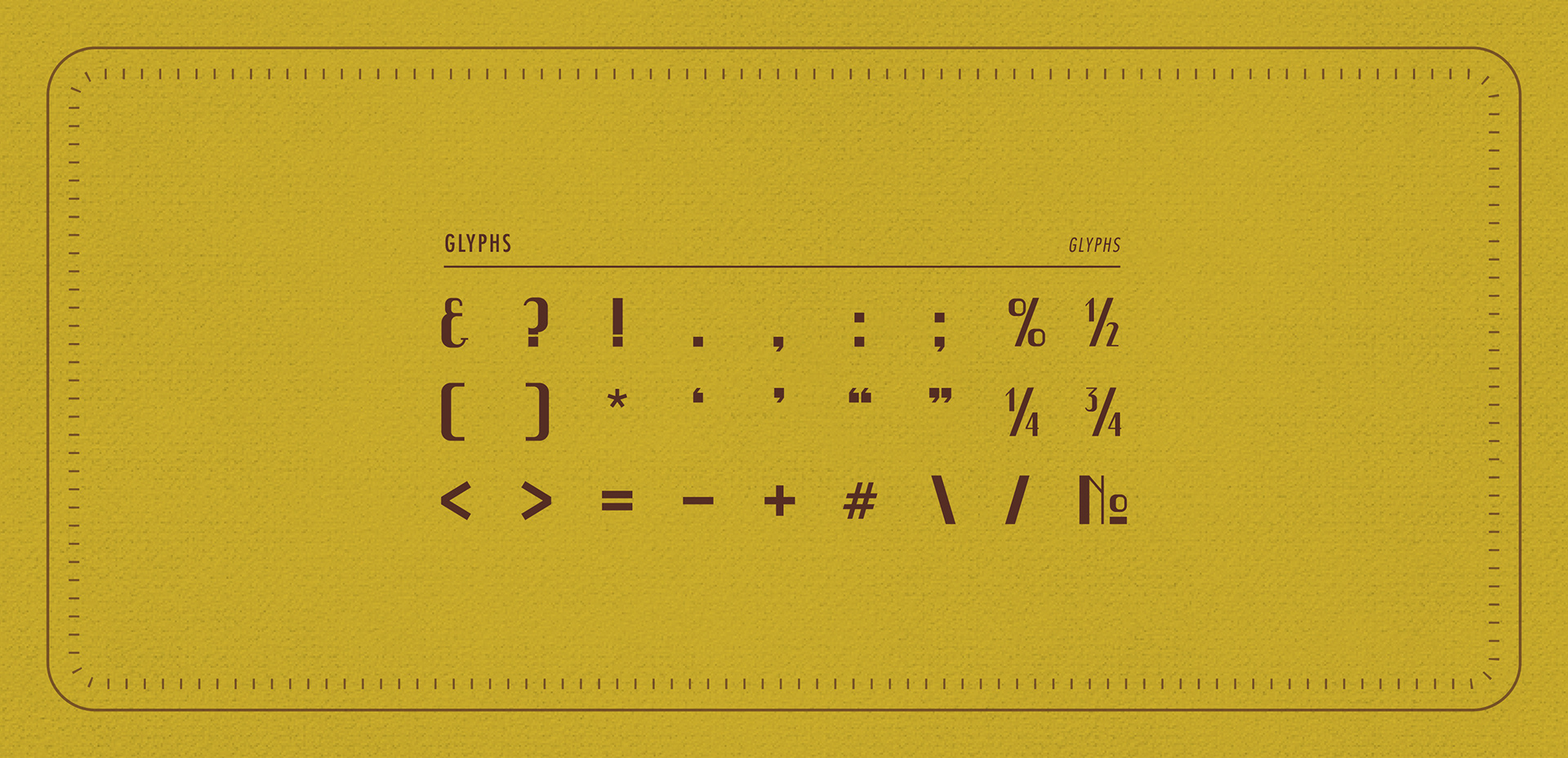
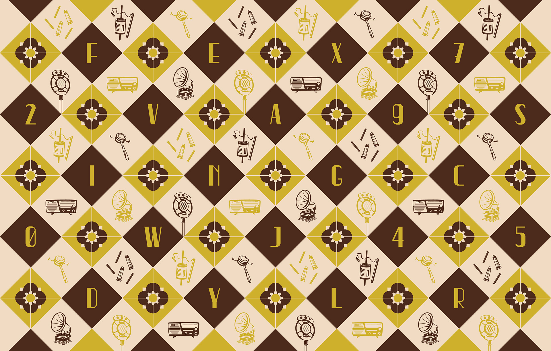
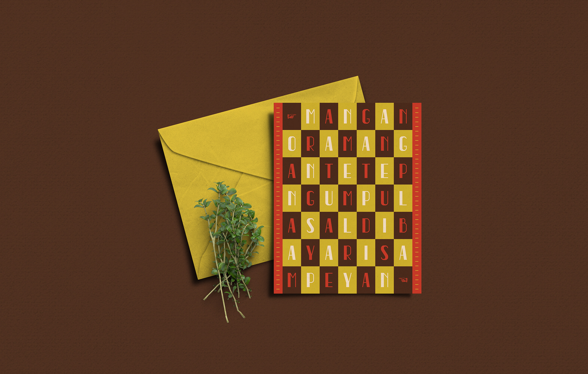
"Tempo Doeloe" is a synthesis of the old Western type and the Javanese Script, made to complete the modern need of retro display text.


Credit:
Specimen book photos by Kevin Geraldo Stefanus.